The Evolution of Brand Logo : Inheriting the Classic, Advancing into the Future.
News 2025-02-19
The Evolution of Brand Logo : Inheriting the Classic, Advancing into the Future.
Brand Growth: The Evolution and Spirit of Our Logo
Since Nicely’s logo was first created, it has undergone multiple refinements while staying true to its core spirit—SLITTING.
In 2025, we are introducing a refined design that blends a modern feel with a sleeker look, highlighting our dedication to refining our expertise and passion for the SLITTING industry.
Nicley Brand Logo Evolution History
|
|
|
|
|
|
 1985
1985
 1991
1991
 2002
2002
 2010
2010
 2025
2025
Related Articles

Integrating Brand Spirit and Visual Identity
Dynamic Structure: Smooth "N" Shape Design
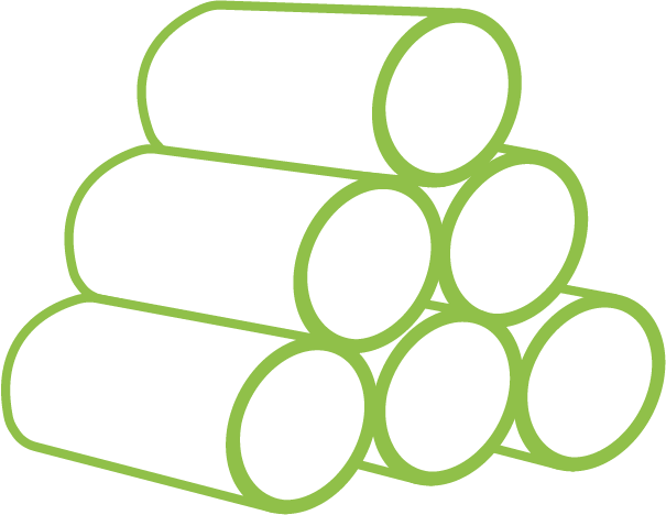
The original logo primarily featured the imagery of slitting, presenting the process from unwinding to rewinding from right to left, forming an "N" shape. This design reflects the English name "NICELY" and symbolizes the slitting process.
Refined Details : A Softer and Finer Perspective
The sharp angles have been smoothed into rounded corners, embodying the essence of “Seamless and Progress” and reflecting our commitment to adaptability and innovation.
Brand Colors: Green Symbolizing Sustainability and Trust
Green was chosen as the spiritual color to represent sustainability, resilience, and
reliability, aligning perfectly with our Chinese name, " 常cháng 青 qīng," which
means "evergreen."

Green as the Standard Color
Symbolizing sustainability, vitality, and reliability.

Unwinding
Side unwinding and material delivery.

Slitting and Rewinding
The slitting and rewinding process.

Aligned with the Standard Wordmark Initials
Connecting seamlessly with the initials of the standard wordmark.
Subscribe to the Nicely Newsletter
Today to stay ahead with the latest industry trends and company updates.
